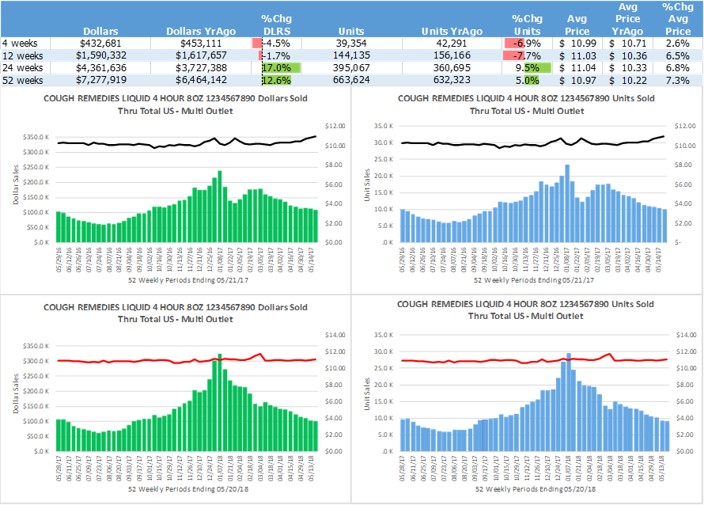
Two Year TrendModel will capture the performance of an item, brand, or category in a single page snapshot. This is one of my favorites. See year-over-year weekly performance in terms of units (or EQ volume), dollars, and average price per unit (or volume). On the left side are two graphs showing dollar sales by week for YrAgo (top left graph) and current (lower left graph). The corresponding weekly unit, or volume, sales are on the right. The Average Price per unit are represented by the lines on the graphs and are measured against the right hand axis of each graph.
This view provides nearly instant insight into the product trend this year versus YrAgo. This example shows the results of a service level problem during the peak season YrAgo as the trough in the unit and dollar sales graphs are indicative of lost POS sales that were not recovered. The issue was repeated in the current year, but it had less impact.
Data can be collected from the syndicated data source and dropped into this template with ease. Using filters, the output of the data can be switched to different products and geographies with the click of a button, making it easy to scroll through product lines or categories and see the major trends. Summary statistics at the top group the data into larger time buckets.